…what?
Old times
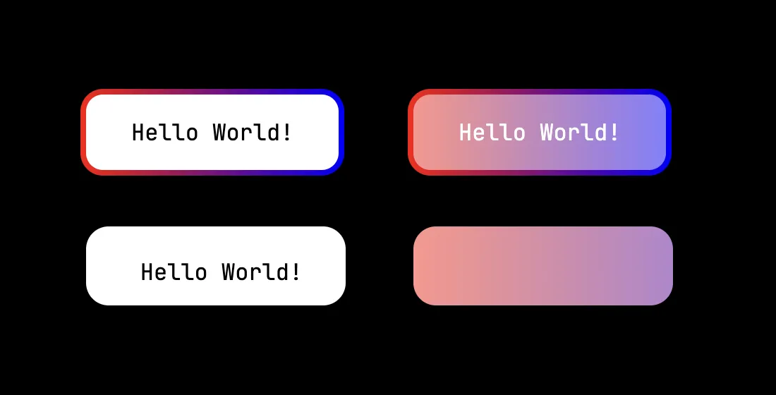
Simple padding-box, border-box won’t cut it, you need clip-path in reverse or polygon, but then how you would control rounded corners?.. Life is tough
:root {
	font-family: "JetBrains Mono", monospace;
}

.outer {
	width: 100%;
	height: 100%;
	background: black;
	padding: 4rem;
	display: grid;
	grid-template-columns: max-content max-content;
	justify-items: start;
	flex-direction: row;
	gap: 2rem;
}

.nasty-border {
	padding: 1rem 2rem;
	border-radius: 1rem;
	border: 4px solid transparent;
	background:
		linear-gradient(white, white) padding-box,
		linear-gradient(to right, red, blue) border-box;
	width: max-content;
}

.nasty-border--transparent {
	background:
		linear-gradient(rgba(255,255,255,0.5), rgba(255,255,255,0.5)) padding-box,
		linear-gradient(to right, red, blue) border-box;
	color: white;
}

.nasty-border--clip-path {
	border-radius: 1rem;
	border: 4px solid transparent;
	background:
		linear-gradient(white, white) padding-box,
		linear-gradient(to right, red, blue) border-box;
	width: 192px;
	height: 64px;
	display: grid;
	place-content: center;
	clip-path: rect(4px 188px 60px 4px round 1rem);
}

.nasty-border--clip-path.nasty-border--transparent {
	background:
		linear-gradient(rgba(255,255,255,0.5), rgba(255,255,255,0.5)) padding-box,
		linear-gradient(to right, red, blue) border-box;
	color: white;
	width: 300px;
	height: 150px;
}<div class="outer">
<div class="nasty-border">
Hello World!
</div>
<div class="nasty-border nasty-border--transparent">
Hello World!
</div>
<div class="nasty-border--clip-path">
<div>
Hello World!
</div>
</div>
<div class="nasty-border--clip-path nasty-border--transparent">
<div>
Hello World!
</div>
</div>
</div>Solution
Turns out all you need is border radius and width, everything else is simple calculations and composition of mask-image.
We draw 4 circles and 4 rectangles with gradients. Two rectangles are for middle part, while other two are for missing borders.
.rounded-border-mask-image {
  mask-image:
    linear-gradient(
      to right,
      #fff 0 var(--border-width),
      transparent var(--border-width) calc(100% - var(--border-width)),
      #fff calc(100% - var(--border-width))
    ),
    linear-gradient(
      to bottom,
      #fff 0 var(--border-width),
      transparent var(--border-width) calc(100% - var(--border-width)),
      #fff calc(100% - var(--border-width))
    ),
    linear-gradient(
      to bottom,
      #fff 0 var(--border-radius),
      transparent var(--border-radius) calc(100% - var(--border-radius)),
      #fff calc(100% - var(--border-radius))
    ),
    linear-gradient(
      to right,
      transparent 0 var(--border-radius),
      #fff var(--border-radius) calc(100% - var(--border-radius)),
      transparent calc(100% - var(--border-radius)) 100%
    ),
    /* bottom-left */
      radial-gradient(
        var(--border-radius) circle at /* radi */
        calc(var(--border-radius)) /* x */
        calc(100% - var(--border-radius)), /* y */
        #fff calc(100% - var(--border-width)),
        transparent calc(100% - var(--border-width))
      ),
    /* bottom-right */
      radial-gradient(
        var(--border-radius) circle at /* radi */
        calc(100% - var(--border-radius)) /* x */
        calc(100% - var(--border-radius)), /* y */
        #fff calc(100% - var(--border-width)),
        transparent calc(100% - var(--border-width))
      ),
    /* top-right */
      radial-gradient(
        var(--border-radius) circle at /* radi */
        calc(100% - var(--border-radius)) /* x */
        calc(var(--border-radius)), /* y */
        #fff calc(100% - var(--border-width)),
        transparent calc(100% - var(--border-width))
      ),
    /* top-left */
      radial-gradient(
        var(--border-radius) circle at /* radi */
        calc(var(--border-radius)) /* x */
        calc(var(--border-radius)), /* y */
        #fff calc(100% - var(--border-width)),
        transparent calc(100% - var(--border-width))
      );

  /*
    mask-composite: from right to left,
    mask-image: from bottom to top;
    add 4 circles and horizontal fill between middles of circles
    subtract this from vertical fill
    add left and right borders
  */
  mask-composite: add, add, subtract, add, add, add, add;
}
This allows to mask for single-value border-radius, which can be extended this to different values on each corner.
Animations are possible too!
* { box-sizing: border-box; text-align: center; }

:root {
	font-family: "JetBrains Mono", monospace;
}

.outer {
	width: 100%;
	height: 100%;
	background: black;
	padding: 4rem;
	display: grid;
	grid-template-columns: max-content;
	gap: 2rem;
}

.rounded-gradient-border {
	position: relative;
	--content-border-radius: 0.125rem;
	--border-width: 0.0625rem;
	--border-gradient: var(--border-gradient, linear-gradient(transparent, transparent));
	border-radius: var(--content-border-radius);
	border-width: var(--border-width) solid transparent;
	z-index: 2;
}

.rounded-gradient-border::before {
	content: '';
	display: block;
	position: absolute;
	inset: calc(-1 * var(--border-width, 0));
	--border-radius: calc(var(--border-width, 0) + var(--content-border-radius, 0));
	border-radius: var(--border-radius);
	background: var(--border-gradient);
	z-index: -1;
	mask-image:
		linear-gradient(
			to right,
			#fff 0 var(--border-width),
			transparent var(--border-width) calc(100% - var(--border-width)),
			#fff calc(100% - var(--border-width))
		),
		linear-gradient(
			to bottom,
			#fff 0 var(--border-width),
			transparent var(--border-width) calc(100% - var(--border-width)),
			#fff calc(100% - var(--border-width))
		),
		linear-gradient(
			to bottom,
			#fff 0 var(--border-radius),
			transparent var(--border-radius) calc(100% - var(--border-radius)),
			#fff calc(100% - var(--border-radius))
		),
		linear-gradient(
			to right,
			transparent 0 var(--border-radius),
			#fff var(--border-radius) calc(100% - var(--border-radius)),
			transparent calc(100% - var(--border-radius)) 100%
		),
		/* bottom-left */
		radial-gradient(
			var(--border-radius) circle at /* radi */
			calc(var(--border-radius)) /* x */
			calc(100% - var(--border-radius)), /* y */
			#fff calc(100% - var(--border-width)),
			transparent calc(100% - var(--border-width))
		),
		/* bottom-right */
		radial-gradient(
			var(--border-radius) circle at /* radi */
			calc(100% - var(--border-radius)) /* x */
			calc(100% - var(--border-radius)), /* y */
			#fff calc(100% - var(--border-width)),
			transparent calc(100% - var(--border-width))
		),
		/* top-right */
		radial-gradient(
			var(--border-radius) circle at /* radi */
			calc(100% - var(--border-radius)) /* x */
			calc(var(--border-radius)), /* y */
			#fff calc(100% - var(--border-width)),
			transparent calc(100% - var(--border-width))
		),
		/* top-left */
		radial-gradient(
			var(--border-radius) circle at /* radi */
			calc(var(--border-radius)) /* x */
			calc(var(--border-radius)), /* y */
			#fff calc(100% - var(--border-width)),
			transparent calc(100% - var(--border-width))
		);

	/*
	mask-composite: from right to left,
	mask-image: from bottom to top;
	add 4 circles and horizontal fill between middles of circles
	subtract this from vertical fill
	add left and right borders
	*/
	mask-composite: add, add, subtract, add, add, add, add;
}

.rounded-gradient-border-content {
	position: relative;
	border-radius: var(--content-border-radius, 0px);
	border: var(--border-width, 0px) solid transparent;
	z-index: 2;
}

.simple {
	padding: 1rem 2rem;
	--content-border-radius: 0.5rem;
	--border-width: 0.25rem;
	background: linear-gradient(to right, rgba(255,0,255,0.5), rgba(255,0,0,0.25));
	--border-gradient: linear-gradient(to bottom, yellow, pink);
	color: white;
}

.conic {
	background: linear-gradient(to top left, #2170ff55, #ffffff55);
	padding: 2rem 4rem;
	--border-width: 0.25rem;
	--content-border-radius: 1rem;
	--bg-angle: 77deg;
	--bg-color-primary: #2170ff;
	--bg-color-secondary: pink;
	--border-gradient: conic-gradient(from var(--bg-angle), var(--bg-color-secondary) 0% 17%, var(--bg-color-primary) 22%, #fff 25%, var(--bg-color-primary) 28%, var(--bg-color-secondary) 33% 67%, var(--bg-color-primary) 72%, #fff 75%, var(--bg-color-primary) 78%, var(--bg-color-secondary) 83% 100%) border-box;
	color: white;
}

@property --bg-angle {
	inherits: false;
	initial-value: 0deg;
	syntax: "<angle>";
}

@keyframes spin-conic-border {
	to {
		--bg-angle: 360deg;
	}
}

.conic-rotate {
	--bg-color-secondary: transparent;
	--border-width: 0.125rem;
	animation: spin-conic-border 10s linear infinite;
}<div class="outer">
<div class="rounded-gradient-border simple">
Hello World!
</div>
<div class="rounded-gradient-border conic">
Radial
</div>
<div class="rounded-gradient-border conic conic-rotate">
Radial spin
</div>
<div class="rounded-gradient-border pulse">
Pulse
</div>
</div>